Primaris Deathwatch Aggressors
Space Marine Chapter founders love a good animal name. Mythical beasts of terror (Howling Griffons, Minotaurs, Silver Drakes…), apex predators (Space Wolves, Celestial Lions, White Panthers…), birds of prey (Hawk Lords, Necropolis Hawks, Raven Guard…), venomous reptiles (Iron Snakes, Viper Legion, Salamanders…). But I’ve just painted these Deathwatch, the Chapter named after tiny insects that burrow into your wooden furniture.
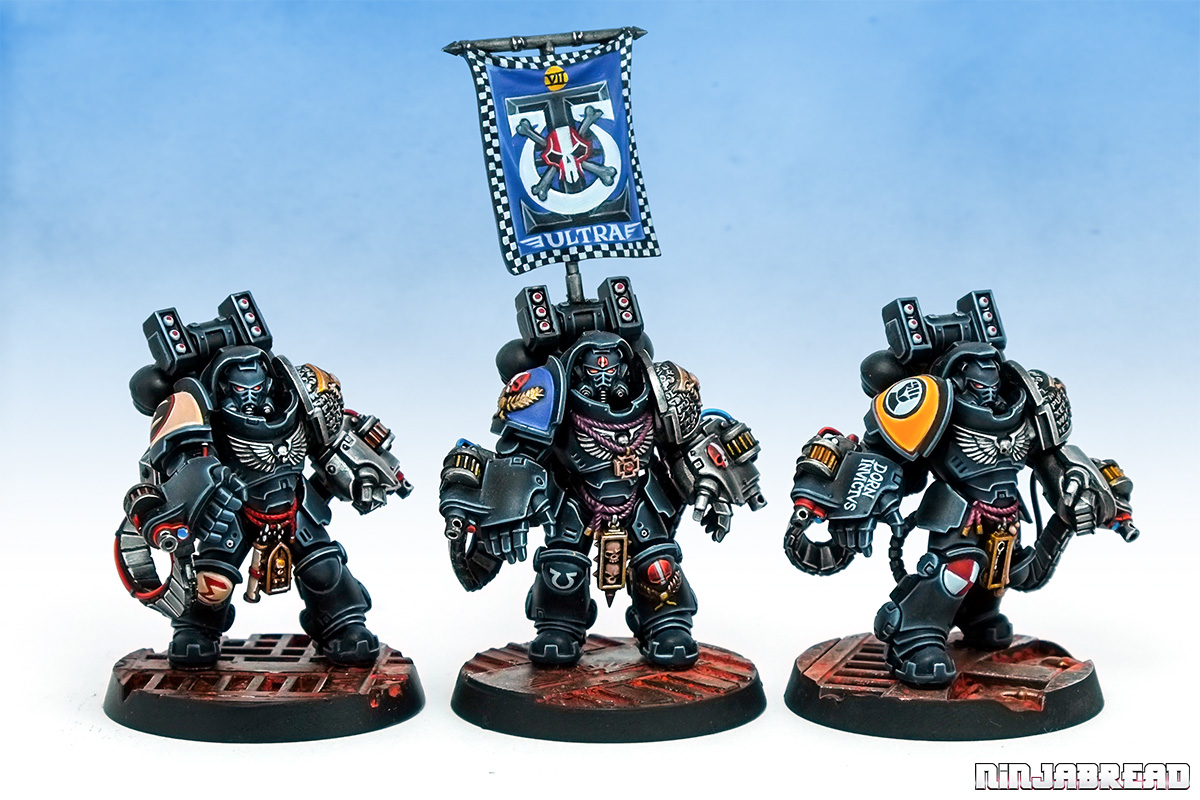
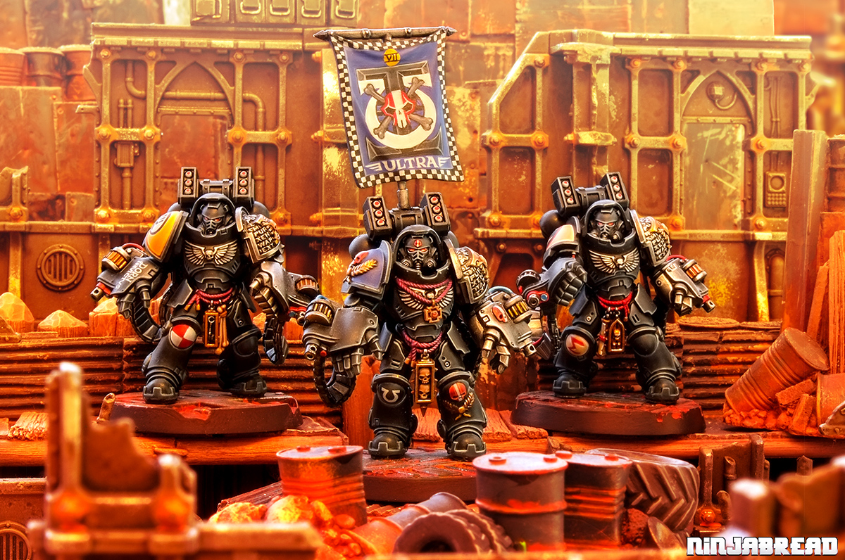
They’ve come to destroy the xeno-filth of the galaxy just like the beetles destroy your antique furniture. I suppose they’re not the only Space Marine chapter named after insects – there’s Mantis Warriors. But Mantises are cool insects that do decapitation and look like samurai. Maybe my problem with the Deathwatch name is just me, growing up binging on episodes of Antiques Roadshow and Lovejoy, and Joe Public just thinks it’s kewl as it starts with “Death” and death is kewl.
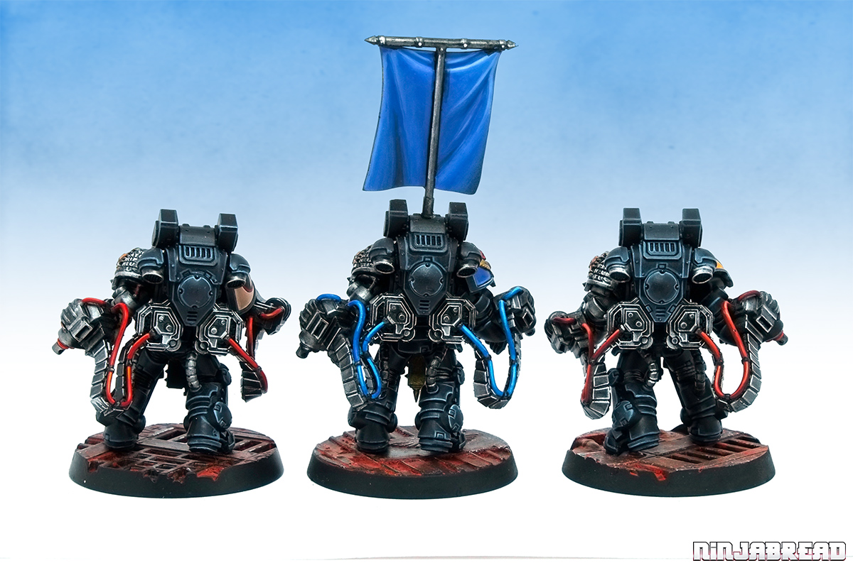
The Primaris Aggressors’ poses are entirely fixed, so the closest thing you get to choice is slicing the tag off the heads so you slightly twist them, though not too much as they’ll just end up staring at the inside of their armoured hoods. Fixed poses aren’t a bad thing, if they’re dramatic, but all three are “video game character selection screen” poses. It would have been cool to them pointing their guns not at the ground, and have the Sergeant pointing dramatically. But attempting any of that requires a filthy amount of modelling work, re-engineering all the pipes and ammo feeds.
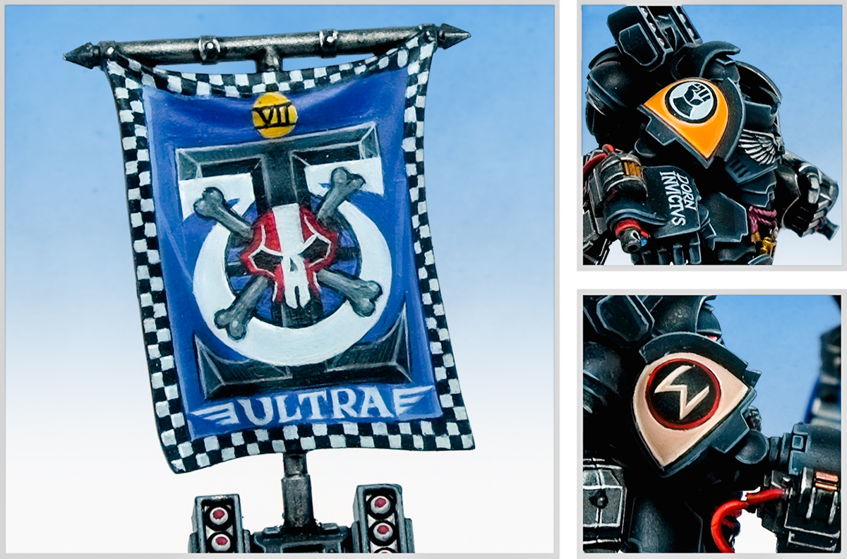
So, with no reposing potential, I stamped these Deathwatch as “mine” with a big freehand banner on the Sergeant. It’s taken from the Ironclad Dreadnought kit – just like my Nemesis Chapter Intercessor Sergeant. The design is a combination of the Deathwatch and Ultramarines chapter icons, bordered with black and white checks. I was super-keen to get Ultramarines icongraphy front and centre since both the Sergeant’s shoulder pads are taken up with sculpted details.
I picked out the Deathwatch skull in red with a white stripe (along with the skulls on the fist, leg and shoulder), echoing the Codex Astartes veteran sergeant helmet markings. He’s named Amorgaudium as it’s High Gothic for Lovejoy – a rascally antiques dealer who understands how terrifying Deathwatch Beetles are.
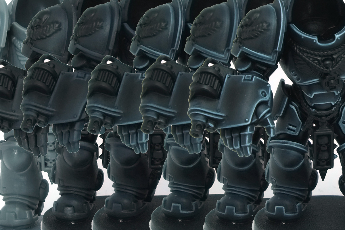
I’ve photographed and written up a masterclass tutorial with all the steps, paint mixes and theory for the black on these Deathwatch. If you’d like access, it’s over on the Ninjabread Patreon page, along with over a dozen other masterclasses.
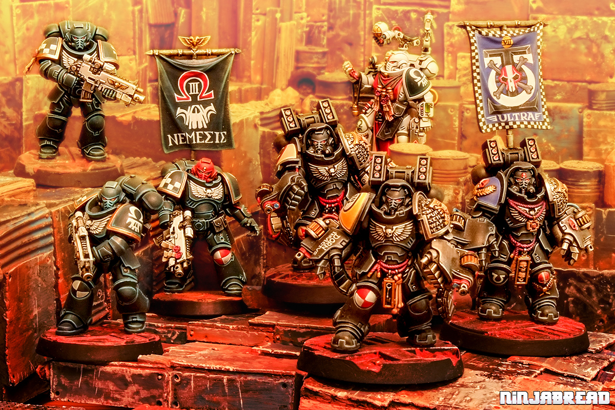
The squad’s now ready to join my Nemesis Chapter army as an Auxiliary Support Detachment. What next for the army? Maybe some Troops, maybe some HQ, (Death)watch this space!

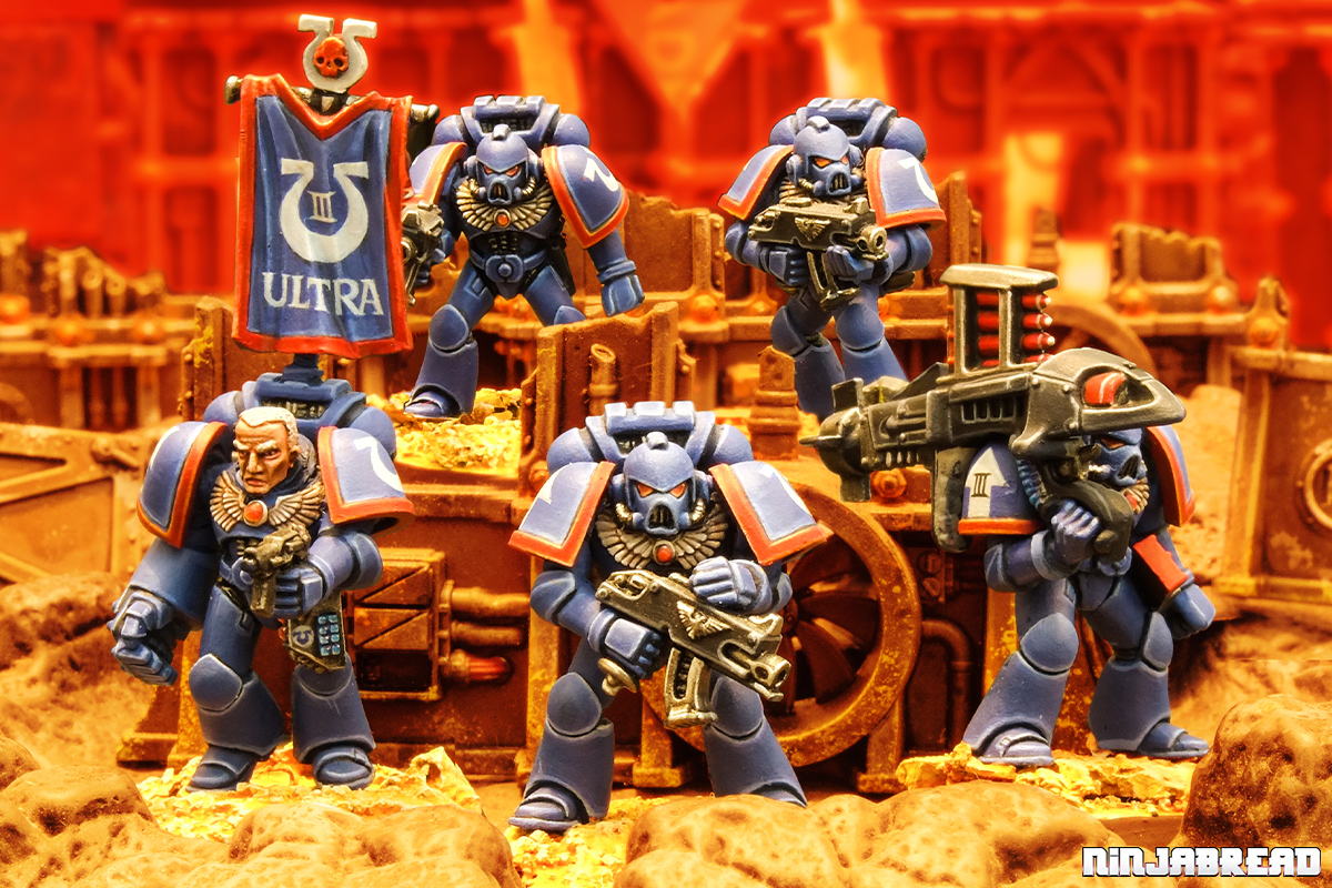
Now you’ve mentioned the Ladybird Legion, you obviously need to paint at least one marine from that august chapter.
YES! The colour scheme would be the obvious. Might work really well on those bulbous-armoured flying Inceptors…
It’s funny that the “agressors” actually have quite a passive pose actually but I think it fits in a “job done” sort of way.
It’s impressive how despite the deathwatch having little in common colour wise with the other guys, the few touches like checkers and red/white patterns, associated with your distinctive paint style make them a cohesive force. Really good, these might be the only truly appealing primaris force i’ve seen so far.
Thanks JB! I was worried they’d look a little too similar together, one being dark turquoise and the other being black highlighted with a turquoise, but I think it works. Better get back to painting some standard marines now though, as the ones in actual Nemesis Chapter colours are in the minority now.
Wow, it’s amazing. I particularly love the banner; not only because of your mastership of freehand, which is pretty obvious, but because of the whole composition and how you combined the elements. Truly great.
Thanks Suber! It took a while to get looking right – the skull and crossbones still strikes me as a bit too Ork Freebootery. But hey hey, onto the next banner!
Your marines a freakin’ amazing. Love the banner and shoulder pad details. I need to have a sit down and work on one of your tutorials again. So far time constraints and not having the proper equipment have made a pigs ear of previous attempts.
Thanks Sean! I’ll have to do one for cars or something so it aligns with whatcha wanna paint!